Diesdas started in 2013 as an experiment to run a creative studio that prioritises people. Today, it’s a thriving, growing digital agency with an impressive range of clients. I helped Diesdas redesign their brand, site and content in order to showcase their growth to the outside world.
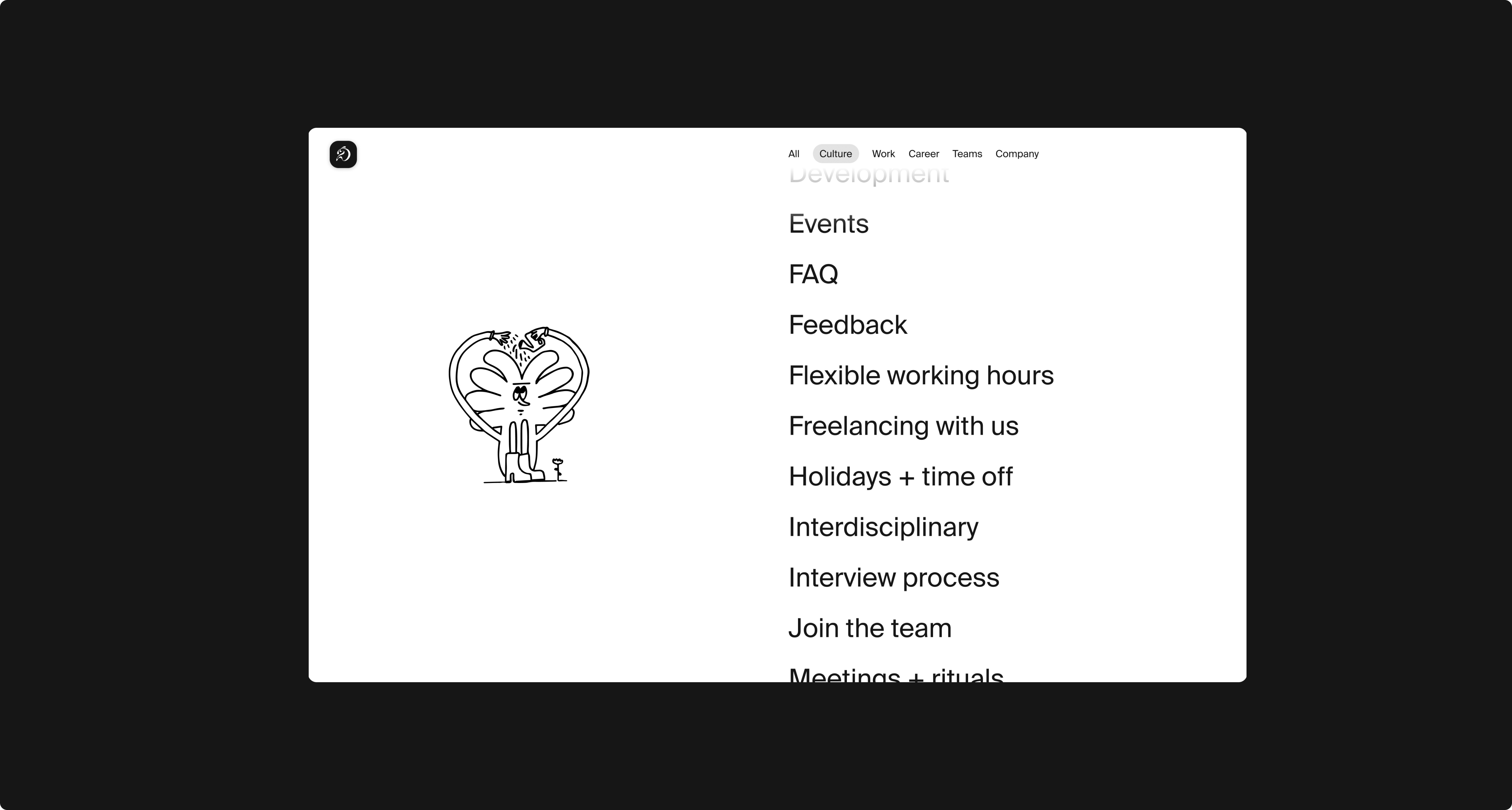
We started the redesign process in a non-traditional way: designing the brand around the site. As a digital agency, Diesdas's needs were firmly shaped around their web presence, and the new look for their site required a real content restructuring. This included their main agency site, playground mode, and the Diesdas wiki - a handbook for future employees about the agency's culture and healthy approach to work.
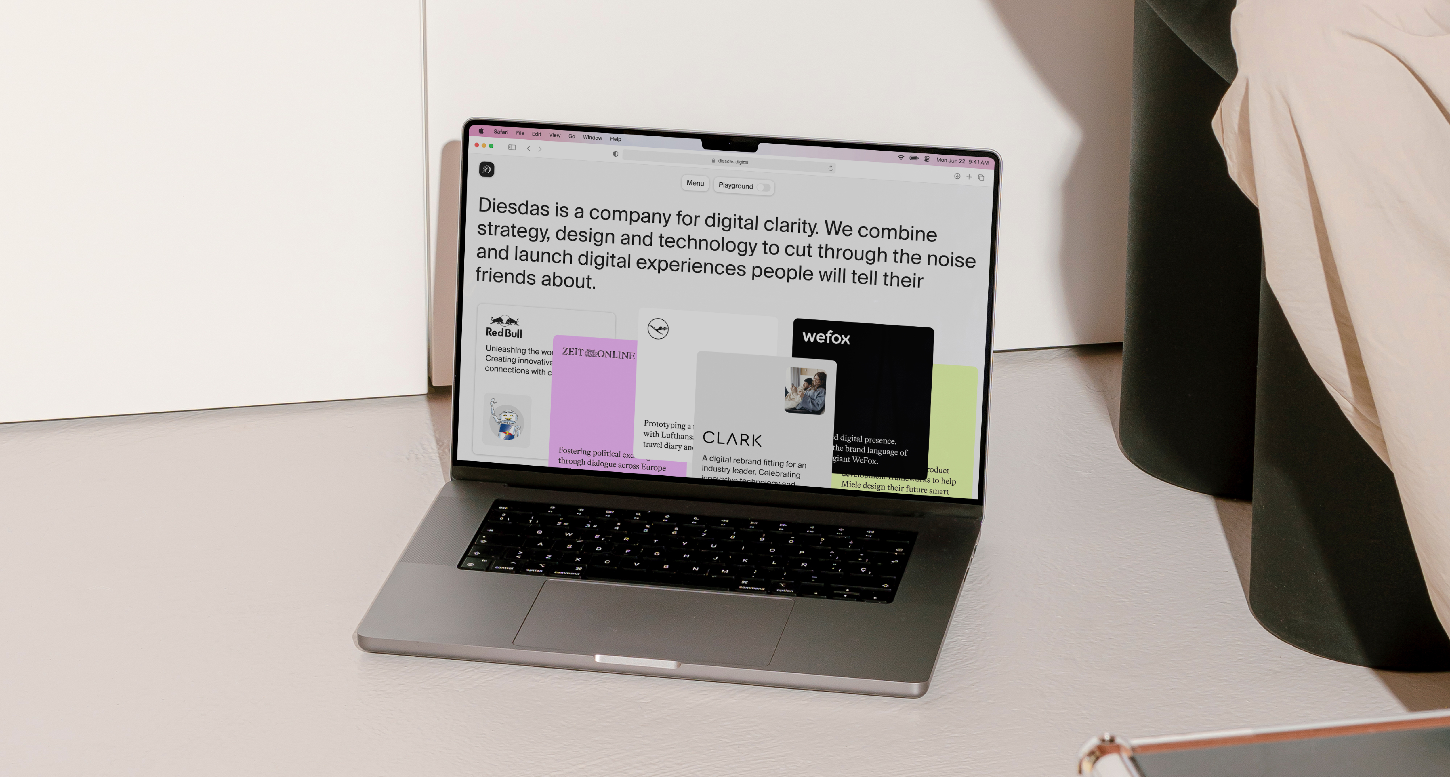
The new website is designed to be highly interactive and engaging. It acts like a single-page application with overlay and pop-up windows instead of traditional subpages. The design is inspired by classic web visuals, particularly those used in iOS applications, and incorporates design elements such as blurred backgrounds, shades of grey, rounded borders, and monochrome drop shadows. I added draggable and stacking cards, scrolling overlays, interesting hover states, and complex animations to create a playful user experience and provide a fresh and modern look for their online presence.
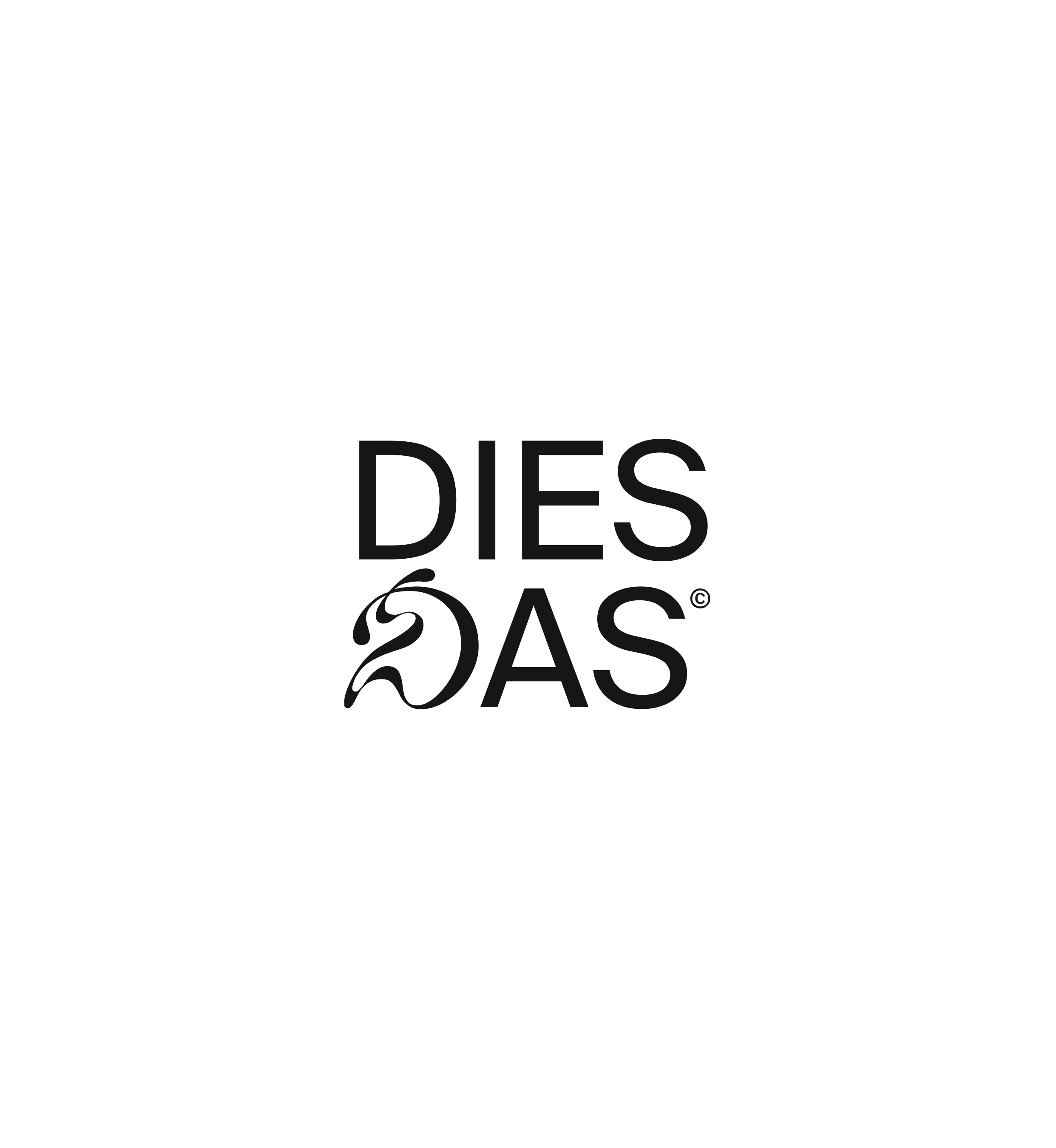

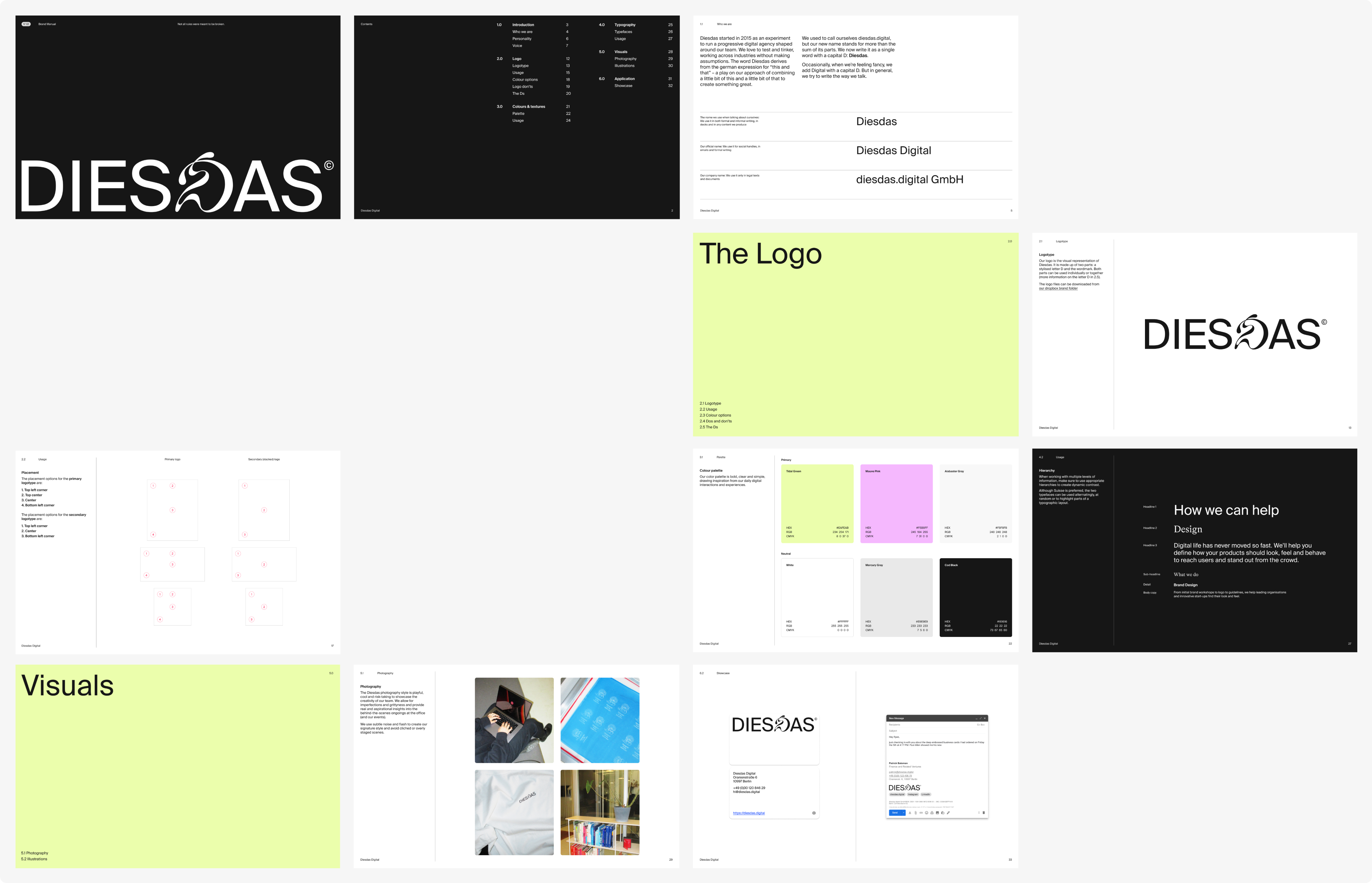
We decided to rename the company from diesdas.digital to Diesdas (or Diesdas Digital) to better reflect the way the team actually refers to the company on a day-to-day basis. The new logo is inspired by the agency's typographic roots – but with a playful twist: the swirly middle D. To help the team navigate the new materials, I created a comprehensive digital brand guide.
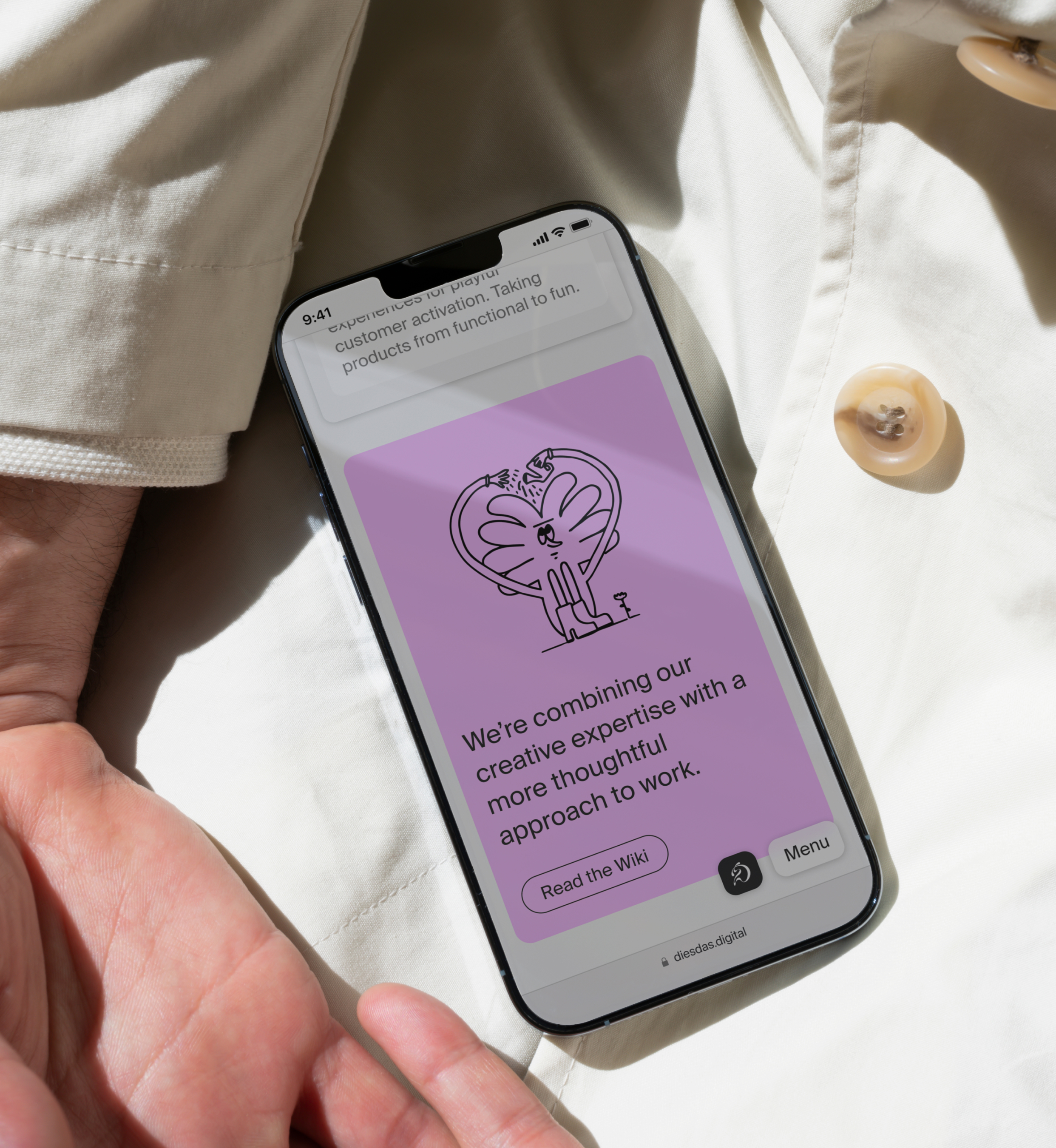
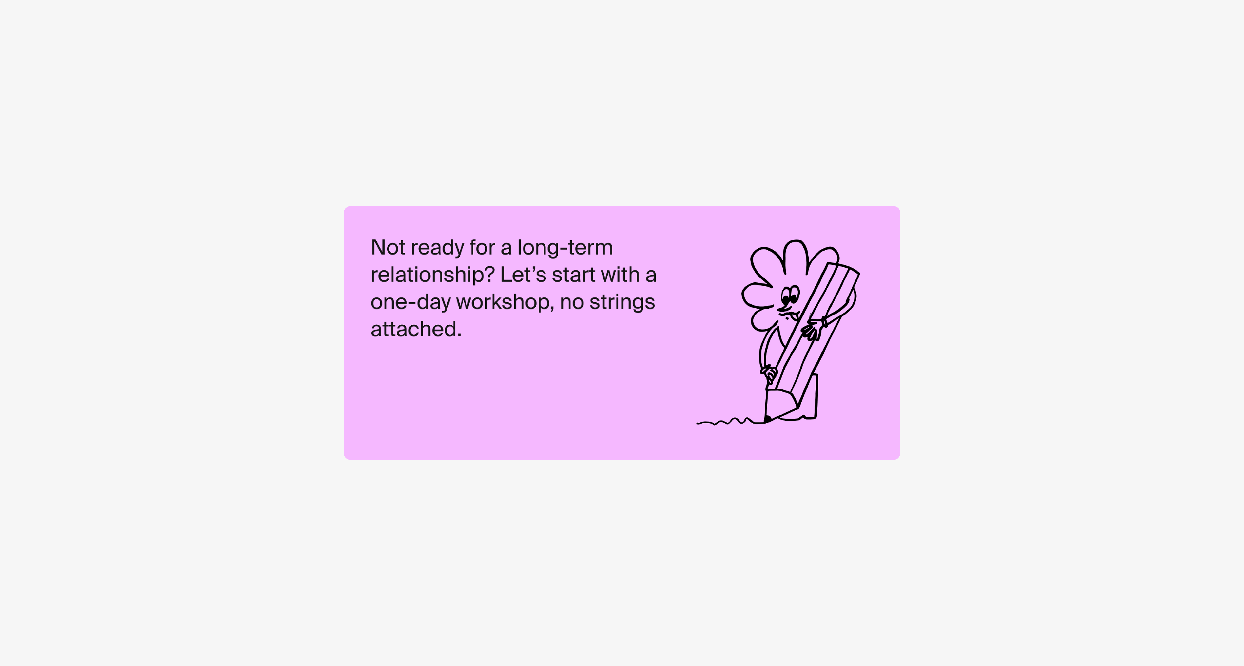
Diesdas's unique personality and approachability were key factors we wanted to highlight in the rebranding process. We developed an illustrative style featuring quirky characters who are featured prominently throughout the site and other collaterals. The new photography style, with its classic Y2K visuals like flash and grain, conveys a candid and approachable vibe that aligns with Diesdas's values.
Drawing inspiration from Diesdas's commitment to honesty and thoughtfulness, we crafted a new tone of voice that would reflect their core values. To achieve this, I created a comprehensive tone of voice and messaging strategy guideline to streamline the writing on the site, blog, and social media. Our messaging approach culminated in a new slogan centred around clarity, which captured the essence of Diesdas’s approach.
Throughout the redesign project, I collaborated with colleagues who contributed their skills to create illustrations, photography ideas, and strategic work. Together, we successfully redesigned Diesdas, giving it a fresh start that reflects the agency's unique personality and vision.